



Maria Cristina Fabbian

Italo Calvino series

Book cover design /academic project

This project explores the dialogue between literature and graphic arts. By pairing specific works by M.C. Escher with Calvino’s prose, the design mirrors the labyrinthine and self-reflexive nature of the narratives. The circular geometry serves as a visual metaphor for the cosmic and combinatorial themes characteristic of the author.

Italo Calvino series

Italo Calvino – Il castello dei destini incrociati

Cover: “Double Planetoid”, 1949, M.C. Escher

Italo Calvino series

Italo Calvino – Se una notte d’inverno un viaggiatore

Cover: “Circle Limit II”, 1959, M.C. Escher

Italo Calvino series

Italo Calvino – Ti con zero

Cover: “Sphere Spirals”, 1958, M.C. Escher

Fanzine Archive

Experimental publications

A collection of independent fanzines exploring diverse thematic subjects through experimental editorial formats. The series focuses on material research, utilizing varied binding and printing techniques to redefine the tactile experience of the printed object.

Fanzine - Superstition

Capturing the allure of superstition and passed-down beliefs, exploring the bond between mother and daughter through the intimate lens of family images


Fanzine - Luck

Capturing the high-stakes emotions and suspense of gaming mechanics


Fanzine - Consequences

Mapping a flow of consequences through a visual path of cause and effect

Fanzine - Horoscope of Analogies

The concept of analogy, along with all its synonyms, flows into the relationships between zodiac signs

Fanzine - Next

Do we truly care to know future events in advance?
What’s next?

Book design - Jeanette Winterson

Handmade Collages & Editorial Layout / academic project

A set of bespoke covers for the novel “Written on the Body.” The entire graphic project stems from iconographic research based on analog collage, where paper textures and photography merge to create a tactile, vibrant, and contemporary editorial aesthetic.

Book design - proposal #1

Cover art: collage by Maria Cristina Fabbian

Book design - proposal #2

Cover art: collage by Maria Cristina Fabbian

Book design - proposal #3

Cover art: collage by Maria Cristina Fabbian

Art Noveau - Cover

Editorial concept and layout / academic project

I designed three independent cover directions for Stephen Escritt’s monograph on Art Nouveau. Each proposal explores a unique visual language: architectural ironwork textures, minimalist furniture silhouettes, and ornamental illustrations. The project focuses on the integration of decorative history within a modern typographic system.

Book cover - volume #1

Cover: Suite de trois montants de banc de jardin, 1905, H. Guimard

Illustration: M. C. Fabbian

Book cover - volume #2

Cover: Panneau central de grand balcon, 1905, H. Guimard

Book cover - volume #3

Cover: Orchids Youth, 1896, M. Feldbauer

CD cover design

Experimental series and layout

This series explores the dialogue between sound and photography. I selected each image from my archive, matching its texture and atmosphere with different musical pieces. The focus is on the integration of my pre-existing photographic work into a structured typographic system.

CD cover - David Darling

Photo credits: M. C. Fabbian

CD cover - Meredith Monk

Photo credits: M. C. Fabbian

CD cover - Alva Noto+Ryuichi Sakamoto

Photo credits: M. C. Fabbian

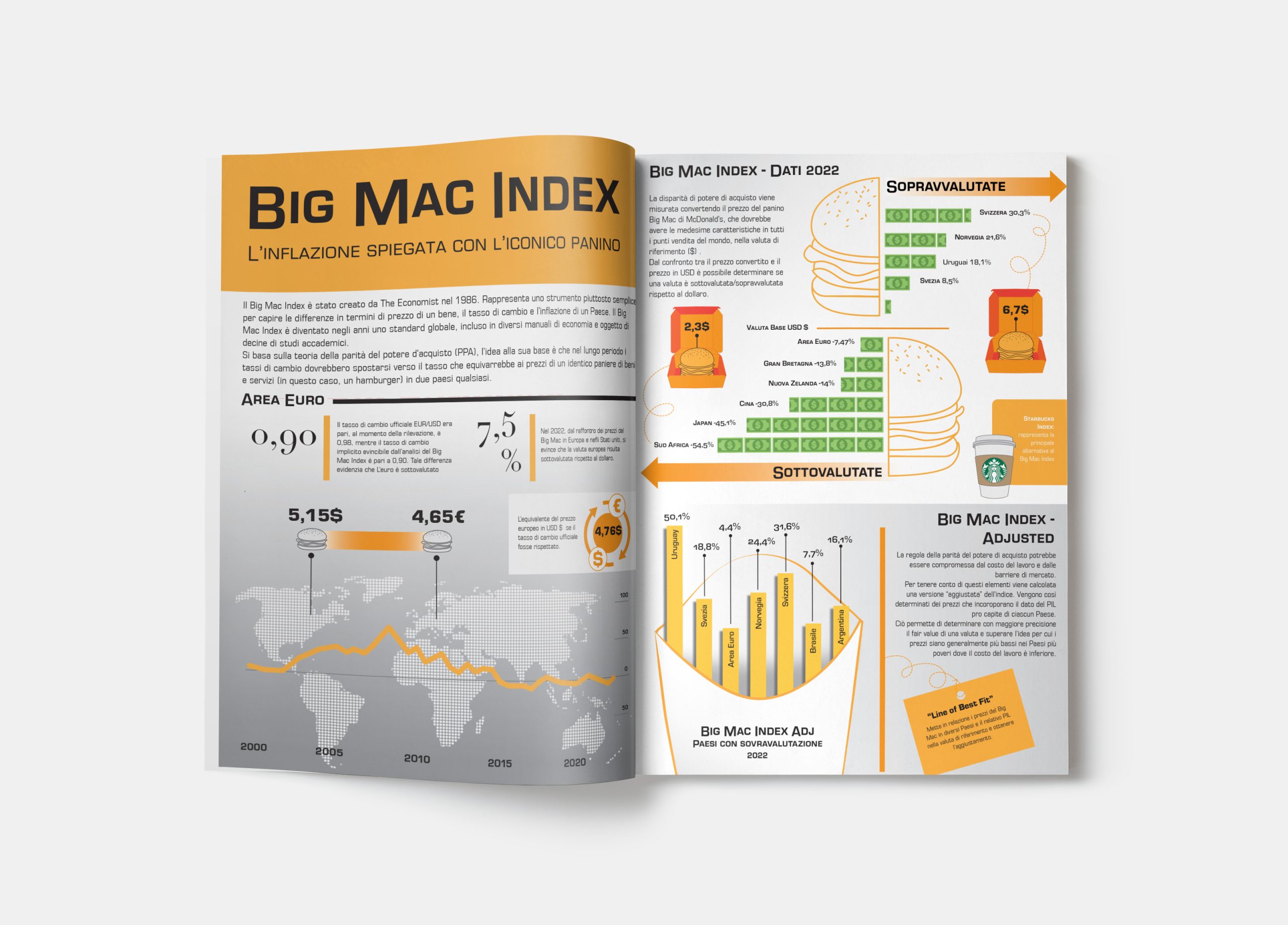
The Big Mac Index

A visual journey through purchasing power and global economics.

Drawing on my background in financial consultancy, this editorial infographic explores the iconic Big Mac Index created by The Economist. The project translates complex economic data—such as purchasing power parity (PPP) and inflation trends—into a structured and engaging visual narrative.

The layout focuses on clarity and hierarchy, using a bold color palette and custom icons to make 2022 global data accessible at a glance. It represents a synthesis of technical precision and strategic design, turning dry statistics into an impactful editorial spread

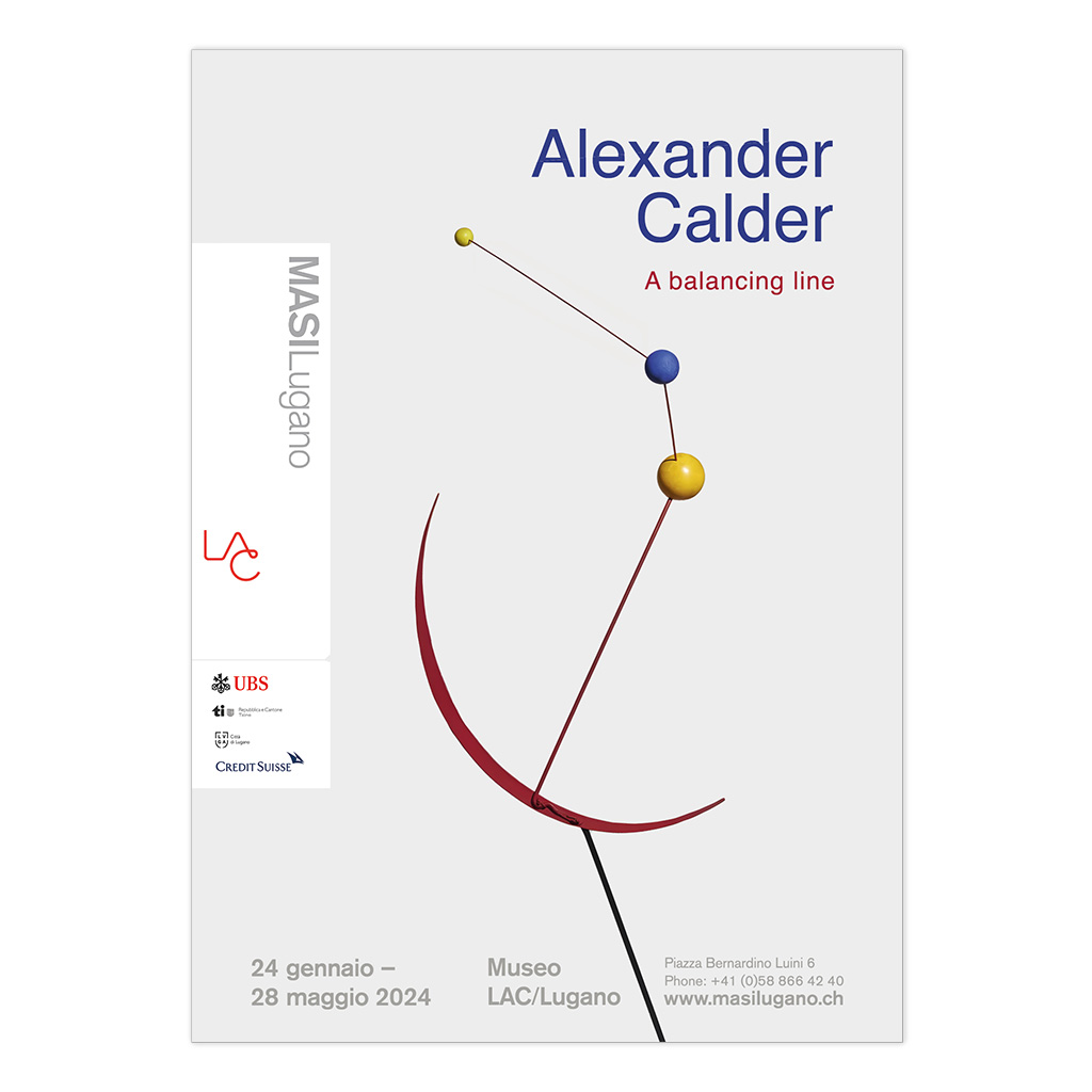
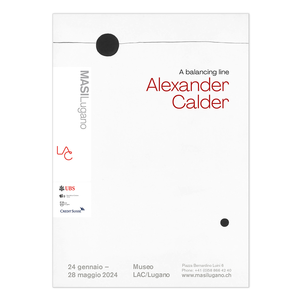
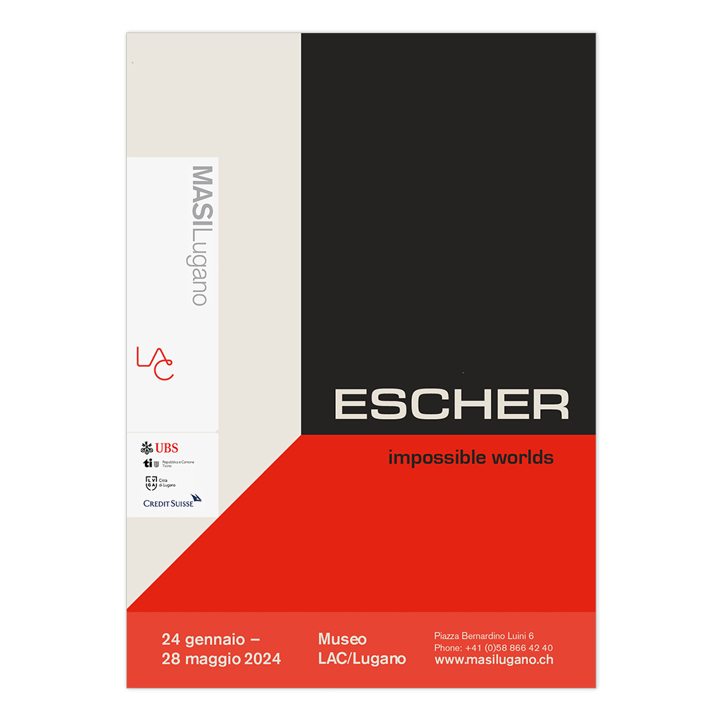
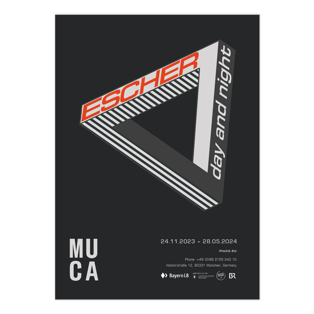
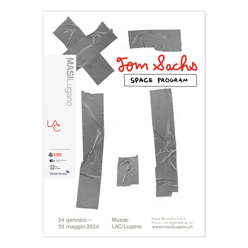
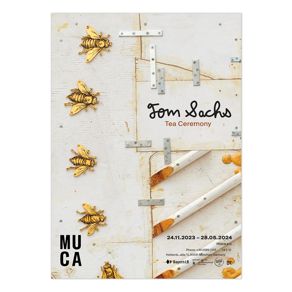
Contemporary Art Posters

Exhibition identity / academic project

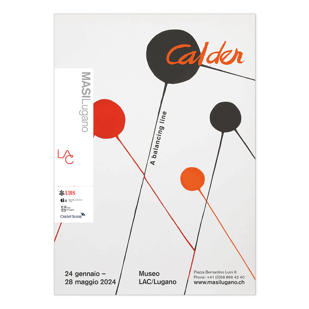
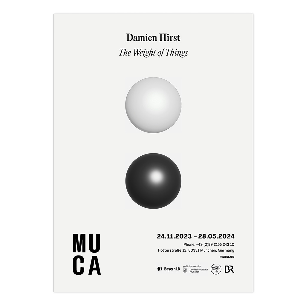
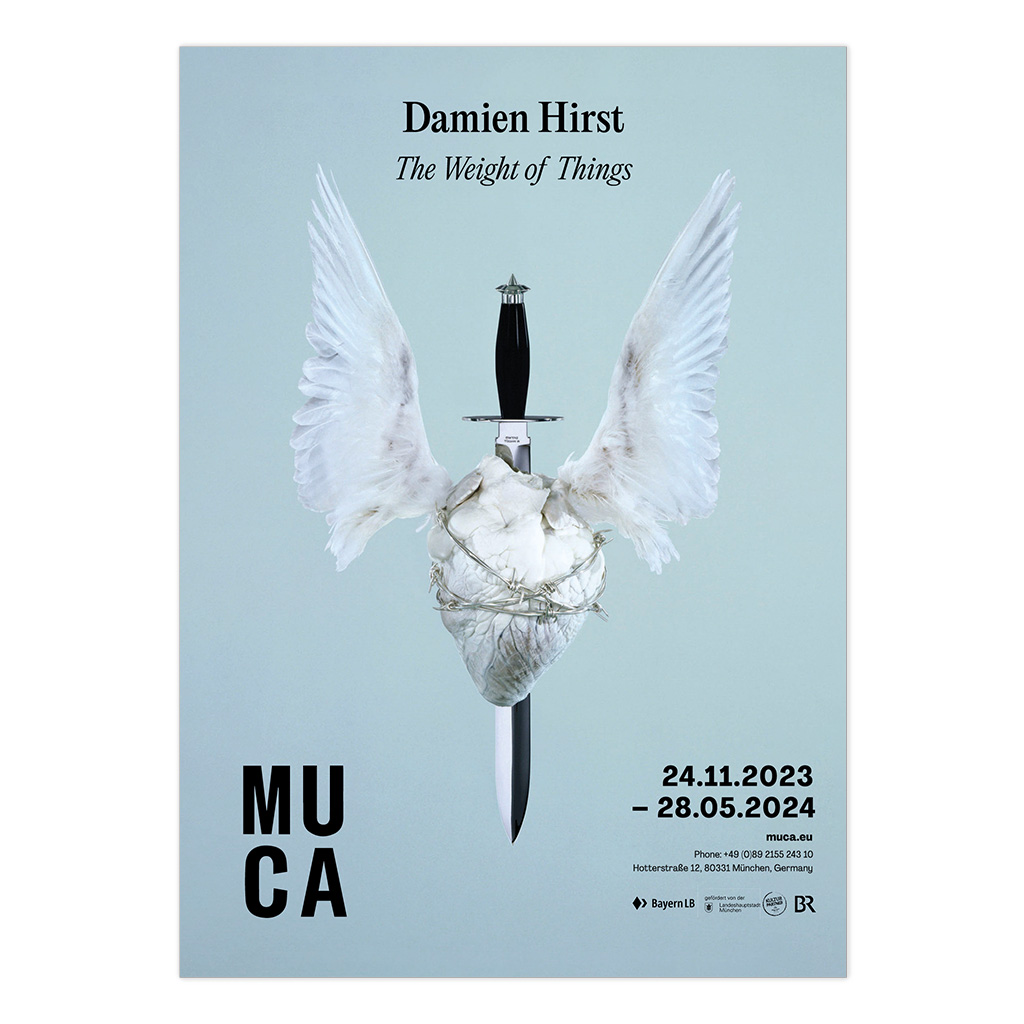
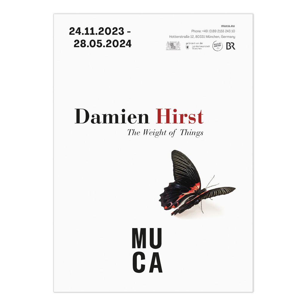
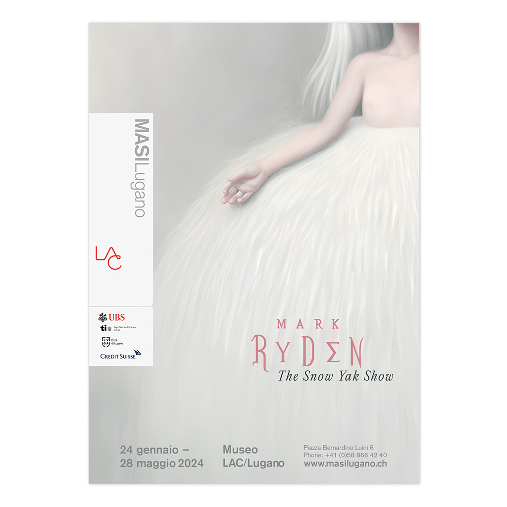
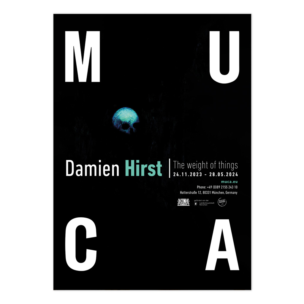
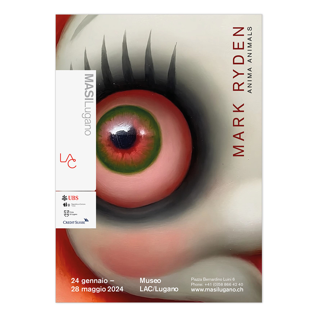
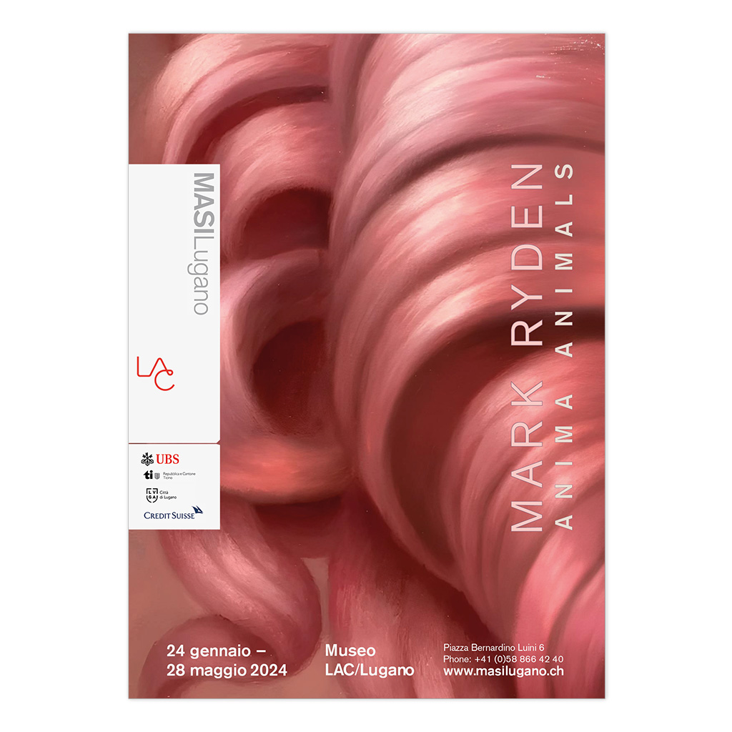
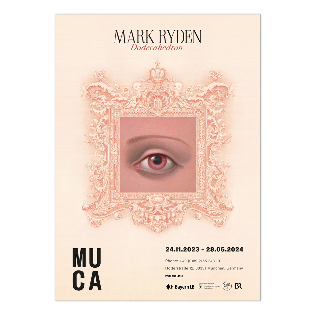
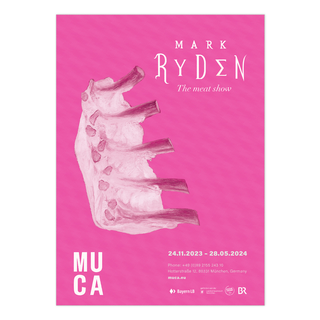
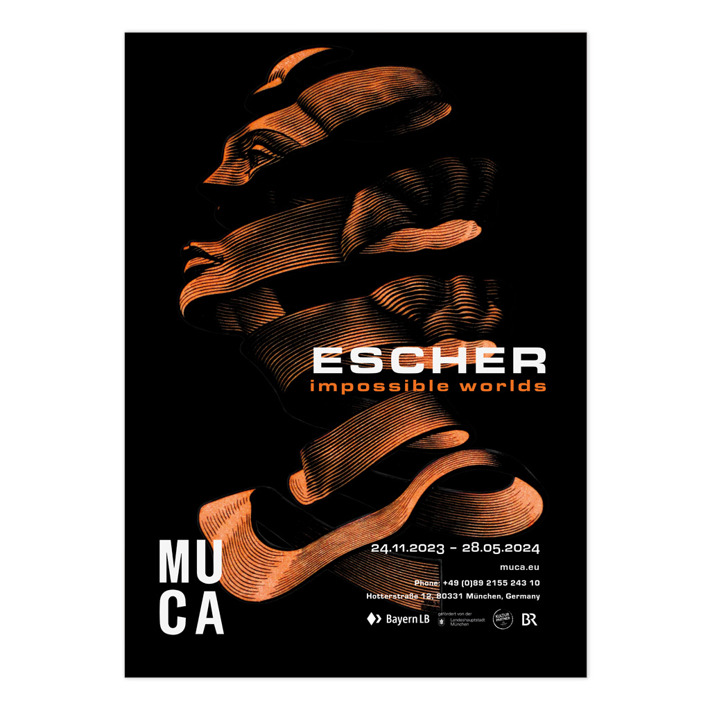
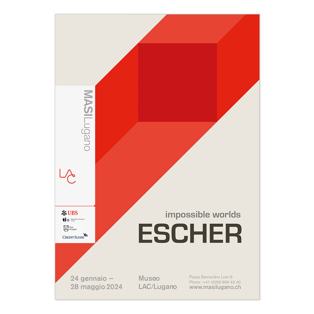
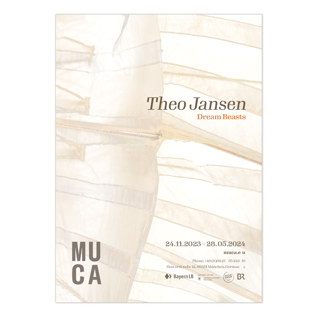
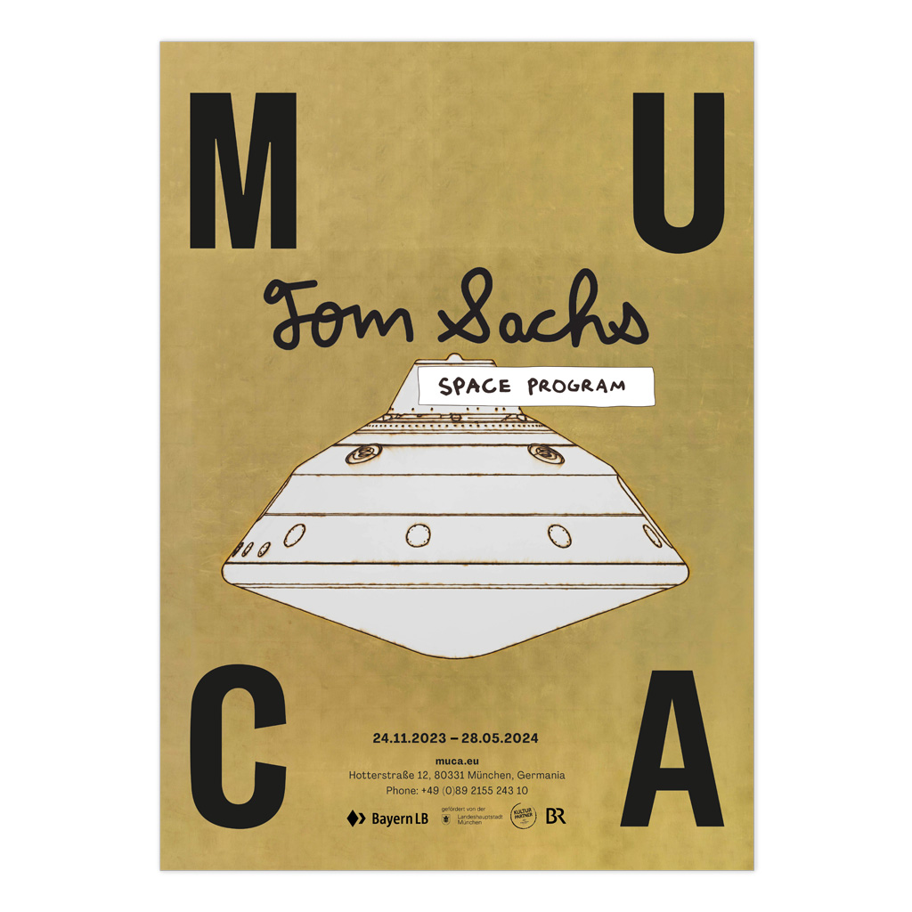
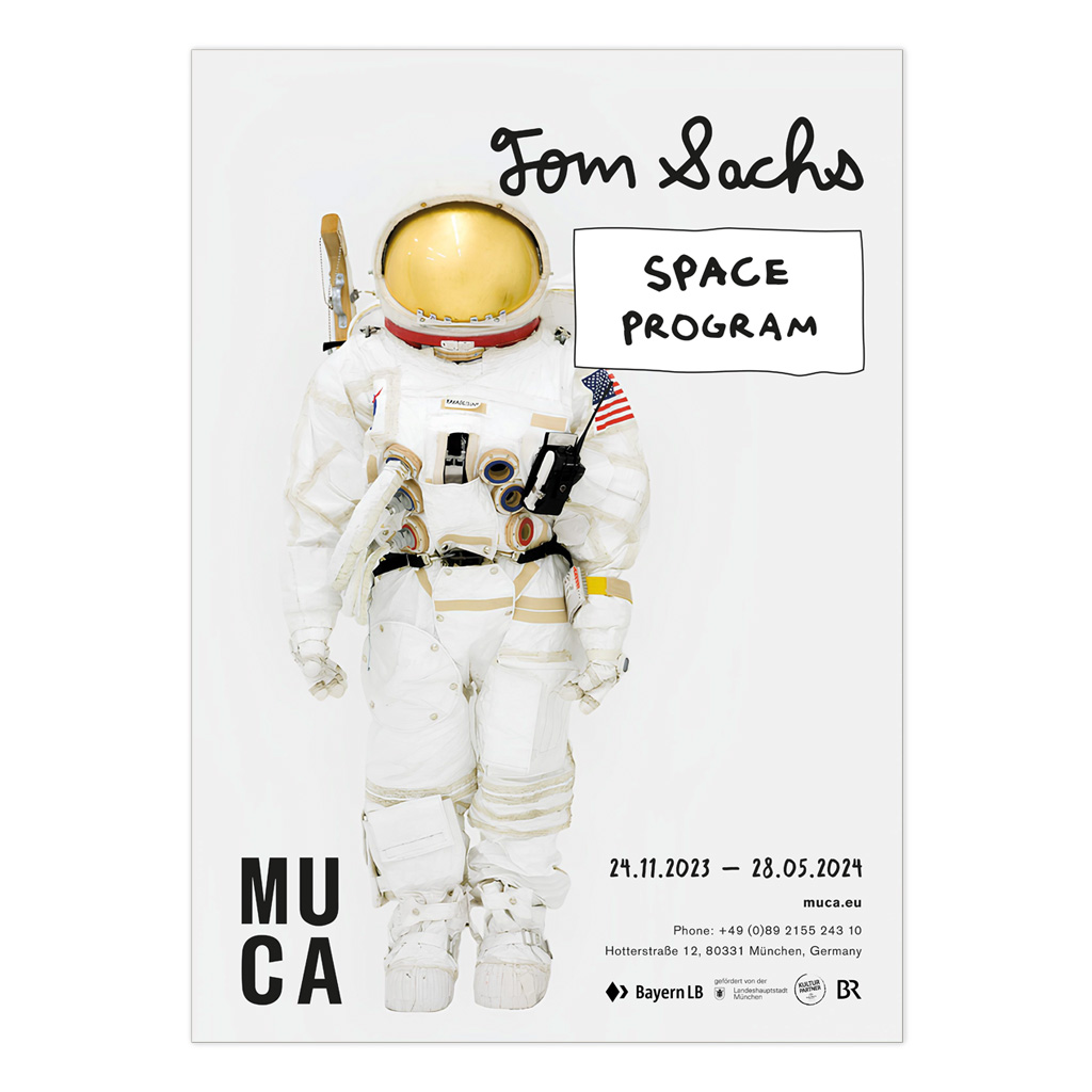
A series of posters developed as a design study for contemporary art exhibitions. The project focuses on translating the distinct visual languages of artists—Alexander Calder, Damien Hirst, Mark Ryden, and M.C. Escher—into cohesive institutional layouts. Each piece emphasizes typographic hierarchy and symbolic synthesis tailored for museum contexts.

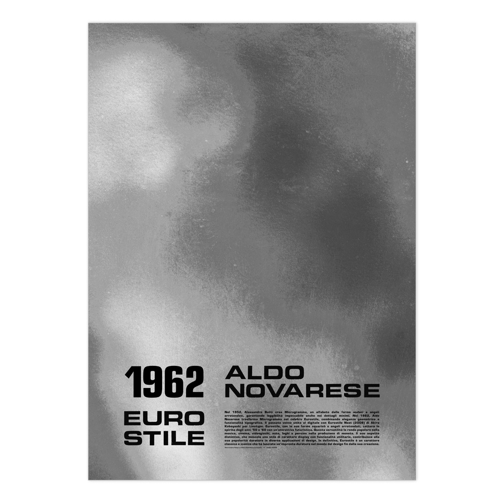
Eurostile Morphology

Typographic exploration and layout

A graphic celebration of the Eurostile typeface and its widespread application in technical environments. The project explores the font’s squared sans-serif anatomy, referencing its historical use in automotive dashboards, computer technology, and space-age aesthetics. The design utilizes a strict grid to emphasize the functional and futuristic character of Novarese’s original 1962 release.

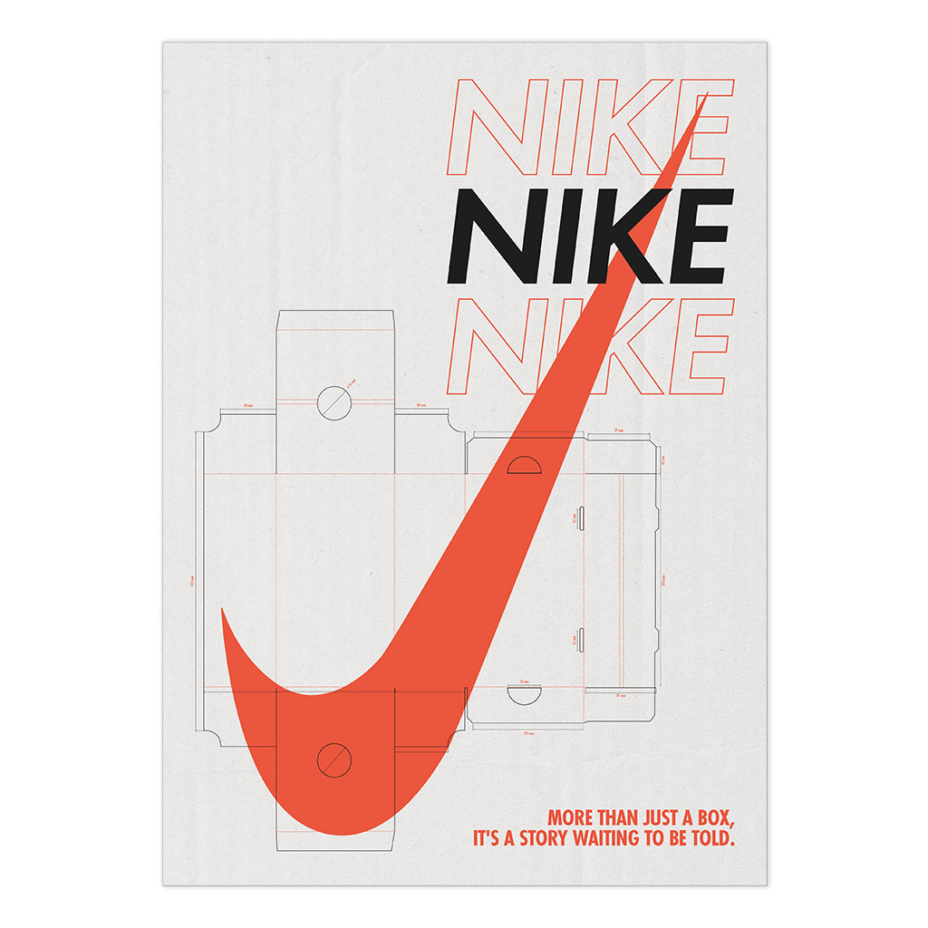
Nike Anatomy of a Brand

Folder poster / academic project

A visual dissection of Nike’s brand elements. I focused on the relationship between the swoosh, the typography, and the structural dielines of the packaging. As part of this comprehensive project, I produced a fanzine gathering diverse Nike graphics and a structural shoebox prototype with a custom-designed graphic skin.

Found geometries: urban alphabet

From urban observation to graphic abstraction

These posters represent the culmination of this research: a minimalist synthesis where photographic structure meets the expressive power of color, bridging the gap between reality and the graphic sign.

Nike Anatomy of a Brand

Map-fold edition / academic project

I reconstructed iconic Nike graphics on this folder, following the real anatomical dieline. The project includes a physical box I assembled using the official structure and my original graphics.


Nike - Anatomy of a Brand

Nike poster folder (front) 

Nike - Anatomy of a Brand

Nike poster folder (back) 

Nike - Anatomy of a Brand

Nike shoebox – fatihful die-line reproduction. 

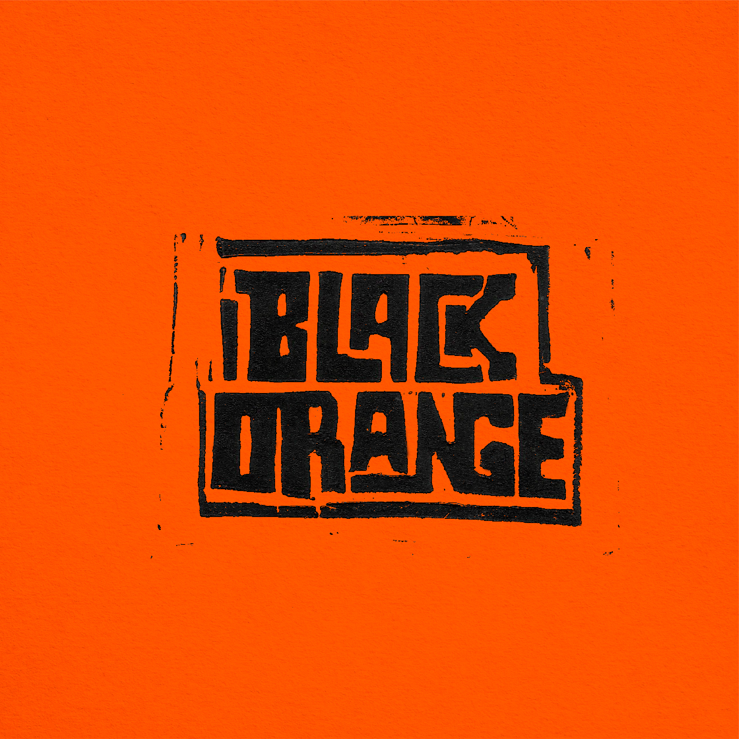
Black Orange

identity and logotype development

A complete rebranding for Black Orange. I developed a new graphic language based on high contrast and analog textures. By utilizing a lino-cut inspired visual style, I integrated the band’s acoustic energy into a solid and recognizable identity system, transitioning from a simple logo to a comprehensive brand experience

Guess rebranding

Logo design and Brand Guidelines / academic project

I redesigned the visual identity for Guess, developing a modernized logo and a comprehensive brand manual. The project focused on structural clarity, documenting usage rules, construction grids, and color palette specifications within a physical horizontal book.

Guess rebranding

Guess Brand Guidelines | A4 Landscape Manual

Guess rebranding

Guess Brand Guidelines | Layout and grid system

Guess rebranding

Guess Brand Guidelines | New Logo